When it comes to design the fonts we choose are pivotal to how good or bad something will look in the end. Whether we know it or not, different typefaces have the ability to cultivate different emotions from us. In a world that’s constantly trying to advertise and market things to us, how we make our customer feel says a lot to how successful we will be.
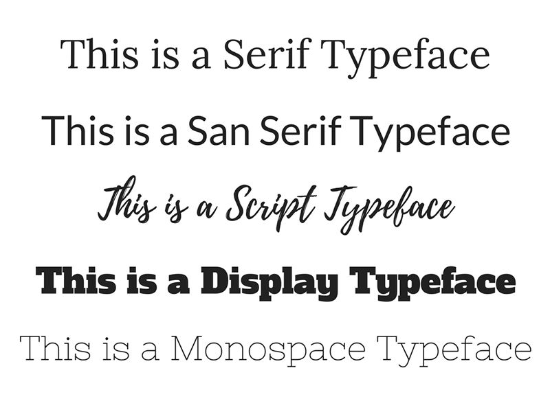
Five Different Kinds of Typefaces:
Serif
Serif fonts are easy to spot because of the “tails” that are attached to every letter. Fonts like Times New Roman, Georgia and Garamond are common examples of Serif fonts. These fonts tend to be used in more mature or professional settings. They are the kinds of fonts that you used when you pulled an all-nighter in college to write a paper, or on a résumé for a job you applied for. These fonts are old-fashioned and timeless and are best when whatever needs to be read is being physically printed.
San Serif
This typeface is similar to Serif in it’s usage, but doesn’t have the attached “tails” to each letter. Ariel, Veranda and Helvetica are common examples of a San Serif font. These fonts are more modern than their Serif counterparts, but are still useful when it comes to informing a reader. They are the kind of fonts we suggest using for your website body copy. While Serif fonts are easy to read in print, San Serif fonts are much easier to read with the resolution of a desktop or mobile screen. It’s imperative that the user is able to easily read the content that is in front of them.
Script / Handwritten 
Script or Handwritten fonts are more decorative and creative. Fonts like French Script and Jenna Sue are designed to recreate actual handwriting making them more causal than a Serif or San Serif font. If used correctly a script or handwritten font can make your user feel casual and at-ease. We would suggest avoiding the use of a Script font for body copy as sometimes these fonts can be hard to read. If a look of a Script font fits for the feel of your design, they can be pleasant as header text. However if a Script or Handwritten font doesn’t go with the feel of the rest of your design, they can look gimmicky and out-of-place. Use with caution!
Display
This type face is again more decorative and creative. Display fonts tend to be more modern and masculine in comparison to Script or Handwritten fonts. They can make a reader feel a sense of urgency and boldness and if not used carefully can make a reader feel like they are being shouted at or hard to read. Fonts like Alfa Slab and Rockwell would not do well as body copy, but are more successful as headers or one-liner text.
Monospace
Monospace fonts are incredibly plain, but are easy to read. They aren’t as professional and widely used as Serif or San Serif fonts, but if used correctly can be beneficial to a reader. Fonts like Courier and Source Code Pro are designed to resemble old typewriter text or old digital computer code. It’s the kind of text you might expect to see on a screenplay for a movie, but not on the website of your local bank teller.
How to Make your Customer Feel with a Font
When you are designing something, think about the voice that you are trying to have come across to your customer. The way you speak to someone often directly correlates with out someone will feel. If you are trying to be straight forward and professional and need body copy use a Serif of San Serif font. If you’re trying to make your user feel like your business if fun and easy-going maybe opt for a Handwritten or Display typeface for your headings and such. If you mix them up it could be confusing.
Think about a stop sign, the words STOP are written in a bold, easy to ready manner so you know to take it seriously. If all stop signs had a script font you’d be much less likely to take it seriously. If you want your customers to feel like you’re cool and fun, don’t use a monospace styled font. If you want your customers to feel like they can trust you and that you’re serious, don’t use a Script or Handwritten font.
One Last Thing… Less is More!

It’s important you don’t stress out your reader by bombarding them with 10 different kinds of fonts. This becomes confusing and could cause a customer to discontinue looking at your design. We suggest selecting a max of three fonts to use for your designs. You can get creative, but still have a clean design with three fonts. For instance you could use Patua One for your headings, Lora in italics for your subheadings and then Open Sans for all your body copy. If you’re choosing a new font for every component of your design it’s much easier to stray from your brand and makes it harder for customers to identify with you.
One of the easiest blunders you can make in design is picking too many fonts that don’t make sense. Don’t pick Comic Sans when you could choose Roboto or Impact when you could choose Comfortaa. Think about the voice of your design and how you want your customer to feel and you can’t go wrong!


