When it comes to branding your head is spinning with thoughts like “what’s my logo going to look like?” “What fonts should I use?” “What am I selling?” but really you can’t move forward when any of these decisions until you know the colors you will be using to represent your brand. Here are some myths and helpful tips when it comes to color psychology and your brand.
The Great Misconception
Although color psychology is a great topic of conversation around a lot of tables, it’s backed with so little factual data. Why is this the case? Well no one person is the same and often their personal preferences, how they were raised and different experiences they’ve had can often distort research done on color psychology. Despite this information, there are still basic principles you can follow as a small business owner when it comes to color persuasion.
Persuading With Colors
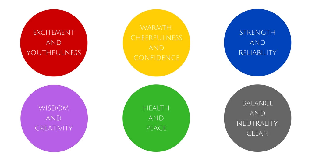
When it comes to putting your brand’s message out there, best results are often yielded from identifying with some sort of emotion with your buyer. Again, personal preferences and experiences could alter these results, but these basic emotions can be said about these colors:
- Red: excitement and youthfulness (Nintendo and Netflix)
- Yellow / Orange: warmth, cheerfulness and confidence (Best Buy and Amazon)
- Blue: strength and reliability (Blue Cross Blue Shield and Walmart)
- Purple: wisdom and creativity (Hallmark and Yahoo!)
- Green: health and peace (Whole Foods and Holiday Inn)
- Whites / Greys / Blacks: balance and neutrality, clean (Apple and Nike)
The fact of the matter is its a feeling or a mood that will determine whether someone is going to purchase what you’re selling and color definitely plays into that. For example if you’re selling a dirt bike and you want your customers to feel rugged and tough then you may stay away from using colors like purple and glitter from your branding. You might go for reds and oranges or even blues that may make your customers feel an emotion of bold, youthful excitement.
Battle of the Sexes
Who you’re marketing your brand to means everything. When it comes to colors there has been a lot of research done that shows color preference between male and female genders. One study done by Joe Hallock showed that blue is typically a color enjoyed by both genders while purple was favored by girls and strongly voted as a least favorite color by men. This probably explains why there isn’t a lot of products targeted for men that are purple. With colors also comes the question of tints and hues. Hallock’s findings showed that men prefer darker and bolder colors while women prefer softer, brighter colors. This is important to keep in mind when you are determining your brand’s target market. If you’re appealing to both genders blue colors might work well for you. If your marketing towards women then maybe pick softer more pastel colors while choosing bolder, shadier colors for men. Again, this is all generalized there are definitely women out there who love hunter green and men who dig lime green, but overall this is a good guideline to follow when it comes to color and genders.
Coordinating Your Colors for Conversions
Think about when you go onto a website for a product you’re on the fence about buying. On the site there’s a call to action button that tells you to “BUY NOW.” Let’s say this brand in particular uses colors like light blue, white and little bit of accented red. Are you more likely to click the button if it’s white or if it’s red? White will likely blend in with the rest of your site, while the red will stand out. When choosing your colors for your brand it’s important to select an accent color that will jump out to your potential customer. Contrast typically will lead to more conversions than blending in with rest of your website.
The Name Game
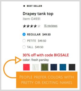
What sounds more appealing to you: dark green or pine green? Light blue or sky blue? Red or raspberry red? In essence they are the same color, but people are much more likely to prefer a color if it’s named something pretty or exciting. Think about Crayons. As a kid were you more likely to pick orange or sunset orange? This works well if you’re trying to sell a product. Most brands have their select colors they sell their products in and more likely than not their products are more successful if they use creative names for colors. For example, when you go online to shop at J Crew they give you color swatch options for their clothing items. The color swatches aren’t simply titled “green” “red” “blue.” They are titled things like “fresh parsley” “ornamental red” “deep blue” colors shoppers can feel like they can identify with and buy.
See your brand in COLOR for what it really means! Once you know who your market is and what you want your potential client to feel from your brand, selecting colors may become that much easier.


