You know the 2004 hit comedy, Anchorman? Remember the part where Ron Burgundy asks his coanchors if they want to know what love is, and they respond “more than anything in the world Ron!” Well Ron should have answered by saying: when your page visitors read an article you put your blood, sweat and tears in and share it on social media.
Lets face it, we love social media! There’s a certain kind instant gratification that can only be experienced when someone likes one of our posts or shares our content. Sometimes we can get carried away and overdo it on the social share buttons on our websites. When this happens we are really only sabotaging ourselves! So here are the dos and don’ts on social share buttons to help you feel the love.
The Don’ts
Blocking Content
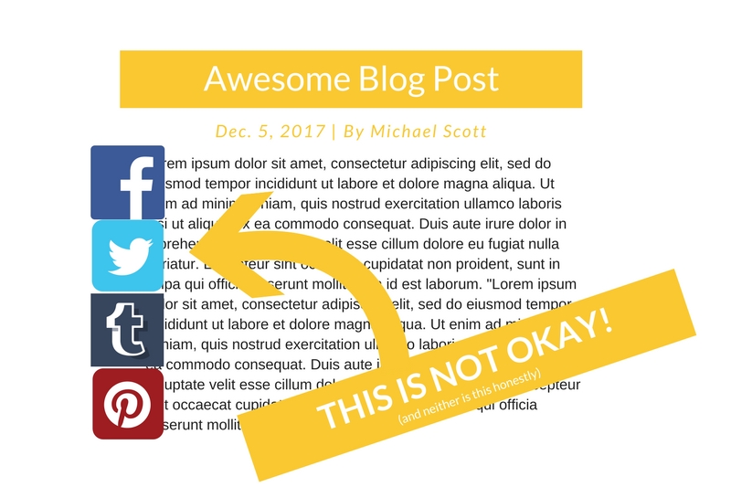
For a moment of some critical thinking, why do people visit our websites? Because they are interested in the content they may find there! Unless your page visitors are pirates and love digging for buried treasure, they’re going to hate if your social share buttons overlap your content or photos. Likely this is an accident, surly no one would intentionally cover the text on their website with their social share buttons, but sometimes we become more concerned with our content being shared that we overlook this error in order for people to see the buttons. What will end up happening is no content will be shared because people may see your buttons, but they can’t see your content.
Button Overload
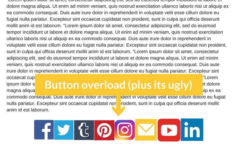
Despite what you may think at first you really don’t need a smorgasbord of social share buttons on your website. Having every single social media icon on the left side of the screen or the bottom of your content isn’t going to give your viewers more options for them to share your content, its going to overwhelm them and maybe even scare them from ever returning again. Be cool.
Friggin’ Pop-Ups
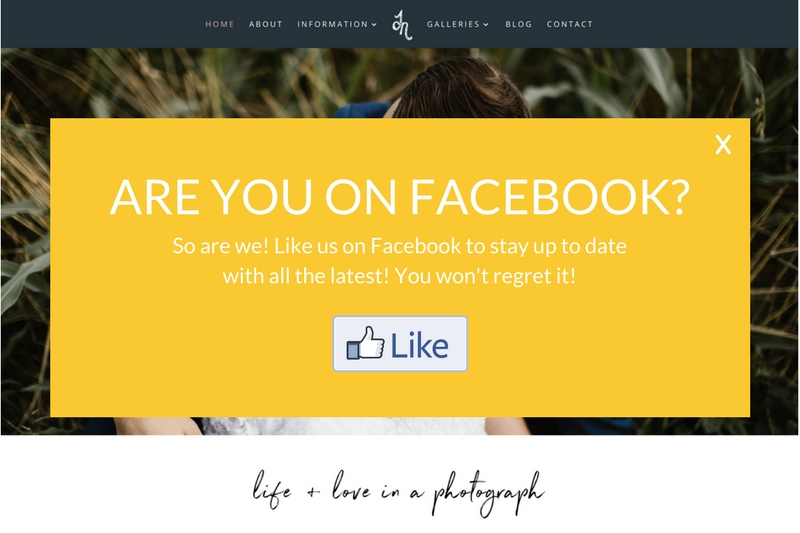
We saved this for last because it truly is the most savage of them all. When you’re viewing a webpage you’re trying to gain information from do you like it when a giant pop-up totally disturbs you from what you were looking at? Chances are you don’t and your website visitors won’t either. Especially if the pop-up is serving as a shouting billboard for your Facebook page or follow you on Twitter. They aren’t going to click the Facebook thumbs up button, but rather the big X right in the corner (maybe they are pirates after all?)
The Dos
Okay so now that we told you all the ways to be annoying with social share buttons let us tell you the appropriate way to use social share buttons on your website.
Less is More
In contrast to having button overload, the less buttons you have the more likely your content will be shared across the board. Our rule of thumb is to stick with three or so share buttons for people to click once they’ve read your amazing content. Facebook and Twitter are typically a give in, but think about your target audience. What social media platforms are they likely to use? Maybe it’s Pinterest or Tumblr, whatever it may be keep it simple and use those buttons. Don’t make your viewers sift through an array of icons to find the one they are looking for.
Simple Consistency Goes a Long Way
There is no need to embed share icons everywhere you look on your webpages (or for the love of everything good in this world, don’t do a pop-up). Pick one or two simple places to place your share buttons. We suggest on the left side of the screen at a size that won’t block your content or at the bottom of your content. Both areas of webpage real estate are not distracting and will keep your website clean, improving your overall user experience and potential for your content to be shared.
Social Share Buttons the Smart Way
It’s easy to lose control when it comes wanting people to share your content, but doing it the wrong way can result in no shares at all! In the wise words of Michael Scott, people will “forward it like its hot” if you keep your social share buttons simple and consistent. So in conclusion, don’t be annoying, you are much more likely to achieve your dream of being on the front page of Reddit if you follow the guidelines of this blog post.
