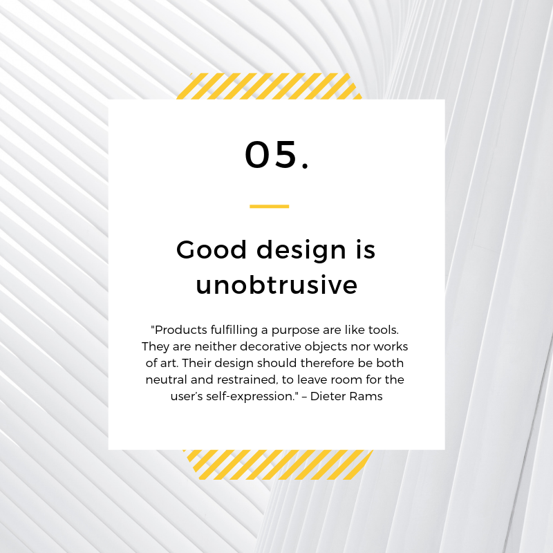
We made it halfway through our series on Dieter Ram’s 10 Principles of Design! If you haven’t read through the first four posts of our series we highly suggest going back and reading through those in addition to reading today’s post. This post is focusing on the fifth principle of design: Good Design is Unobtrusive.
For all things in life, there is a purpose; and when it comes to our products, there’s 100% a purpose in why any consumer would be using it. If you sell bikes then your consumers are wanting to ride a bike, if you sell coffee then your consumers are wanting to sip on a cup of coffee, if you’re a dog walker then your consumers need someone to walk their dog, the examples go on and on.

So when it comes to design, specifically in web design: the goal is to meet the consumers need as fast as possible with minimal distractions. As soon as we begin side tracking a consumer with other things, then we are keeping them from accomplishing a mission they set out to do in the first place.
What does this mean? It means they are likely to get frustrated and go somewhere else.
How can you be sure you aren’t disturbing a consumer in your design? Ask yourself this question: what is the point of this design?
Let’s use the bike shop for an example. You’re currently designing the home page for the website of your bike shop. What’s the point of this home page design? Of course it’s to get them to purchase one of your bikes! So if the home page if filled with these really beautiful photos of bikes, with cool people riding them all over the city, but doesn’t once mention how someone can buy a bike, the design has become obtrusive to the consumer.
A big flaw I think we often run into when designing is mistaking something that “looks beautiful” as successful design. Sure we want it to look good, but the point of a design is rarely to get someone to say “aw how pretty!” it’s to meet their needs, whatever that may be!
So with the bike shop, instead of having an overload of images for your customer to look at, provide them with a strong, clean call-to-action that will take consumers straight to your shopping page with all your bikes.
This doesn’t have to be a buzzkill either. Simple can be beautiful, in fact a consumer is way more likely to appreciate the beauty of a design if it doesn’t hinder them from meeting their need. Honestly, they are more likely to appreciate the design at that point.
Your websites shouldn’t be art galleries of cute, little items that make your website look pretty. Your designs should be a tool, a means to an end for the consumer on a mission to meet a need. Don’t let your extravagant color palettes, neat pop-ups, explosion of photos, etc. stand in the way of making your customer happy!
Next week we’ll be peeling back the layers on Dieter Rams sixth principle of design: good design is honest. Be sure to check back to read that post!


